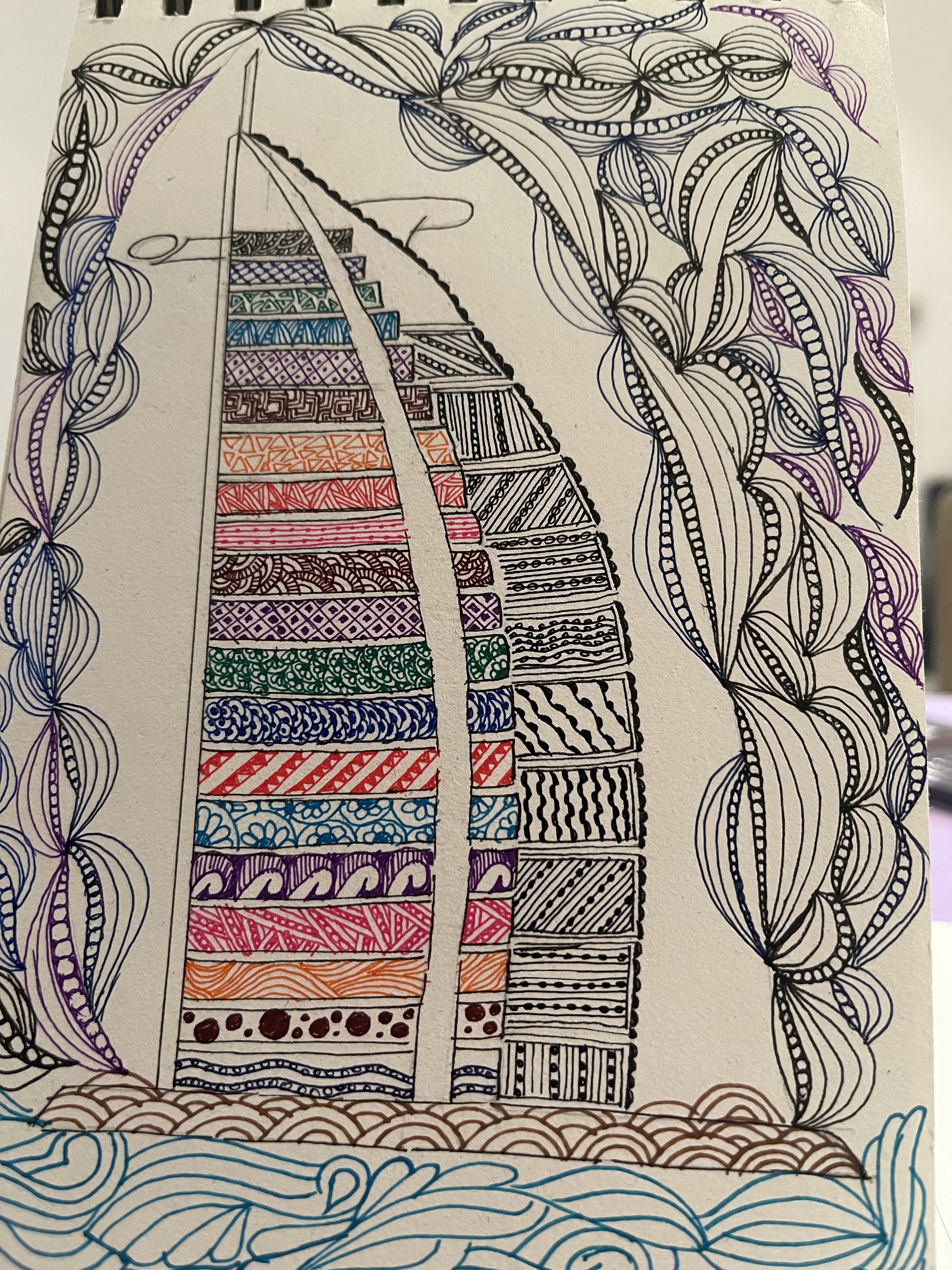
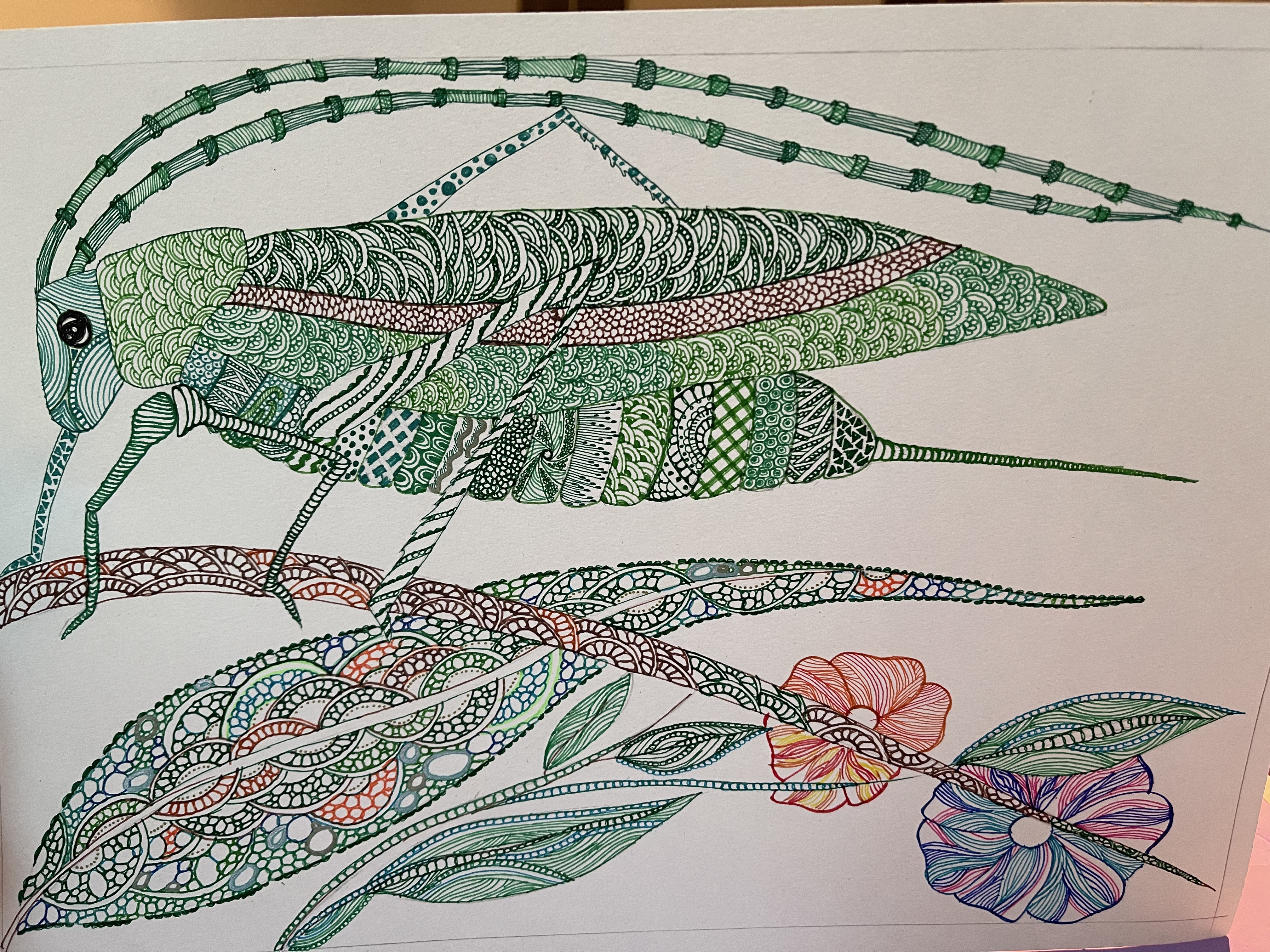
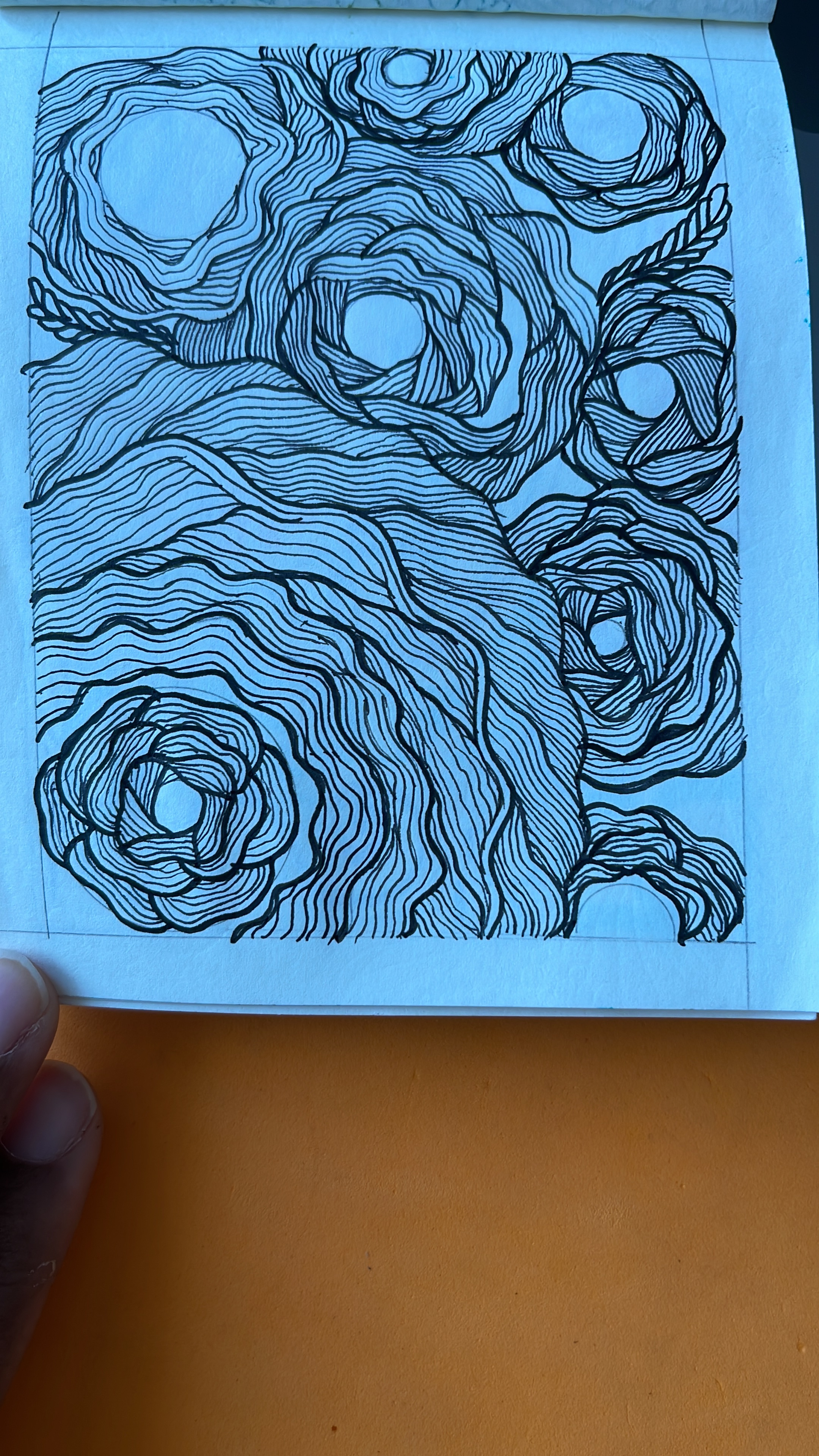
I design, create Zen tangles, sketch, and write.
I’m a product marketing executive based out of Dubai with experience delivering end-to-end advertising and marketing collateral. I’m passionate about the user experience and I am always looking at making the user experience comfortable and easy. This is my foray into UI and UX and designing something that will be of use and easy to use.




Project Brief: Create a responsive website for a large Human Resources company (500+ employees) with multiple departmental access.
My understanding: HRM is a multi-team – Human Resource web portal. The portal should be able to accommodate use by multiple entities and should facilitate hybrid offices.
During my research, I found that most companies use multiple online locations for their everyday use. For the purpose of this project, I used Google Search to find and locate a few reference websites.
For instance, a start-up I worked with earlier, had a portal where the official documentation was saved, while the HR team, which was an outsourced activity had two locations in use. One for payroll and attendance and the other for time sheets. The team used a fourth location for project-related documentation. The numerous investments in terms of resources and inter-operability and therefore vulnerable interactions.
At the other end of that spectrum is an MNC, which used one location for everything, but the constant barrage and the sudden movement of all documentation online, during the pandemic, hit them hard. Personal documentation that used to be manually filed had to move online and there was just no space to home them on the website. For the purpose of this research, this could be most companies, where I have submitted my documents in printed hard copy.
This then created the need for a one place has it all website, which is what HRM proposes to be. Their goal is to be the ‘no-paper trail’ sustainable option that is completely online today.
A project completion is defined with the fulfillment of a series of steps. And this is where documentation is important, because it gives you the freedom to go back and forth every step of the way.
Step 1 Brainstorming
The project started with a brainstorming session on the kind of information that would be included on the website.
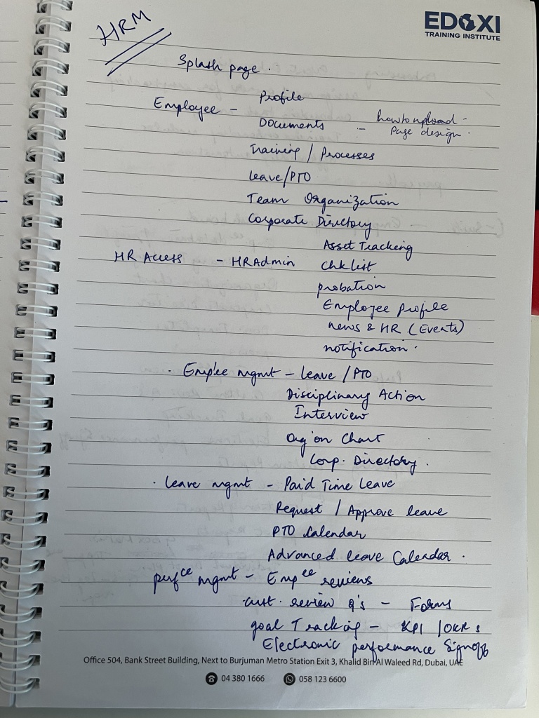


This is the final list of items to be listed on the website. A chart of each tab and sub-tab.
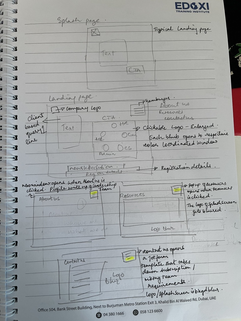
Step 2 Sketching
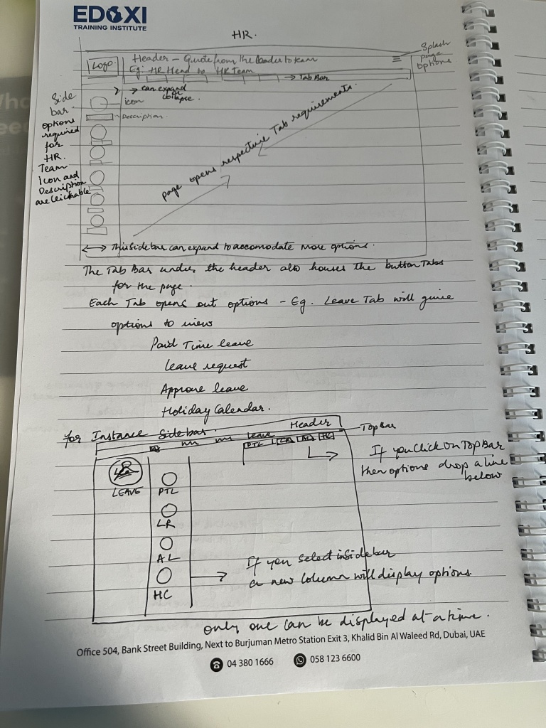
This is followed by the rough sketching on the page of what the webpage should look like.
Step 3 Flowchart
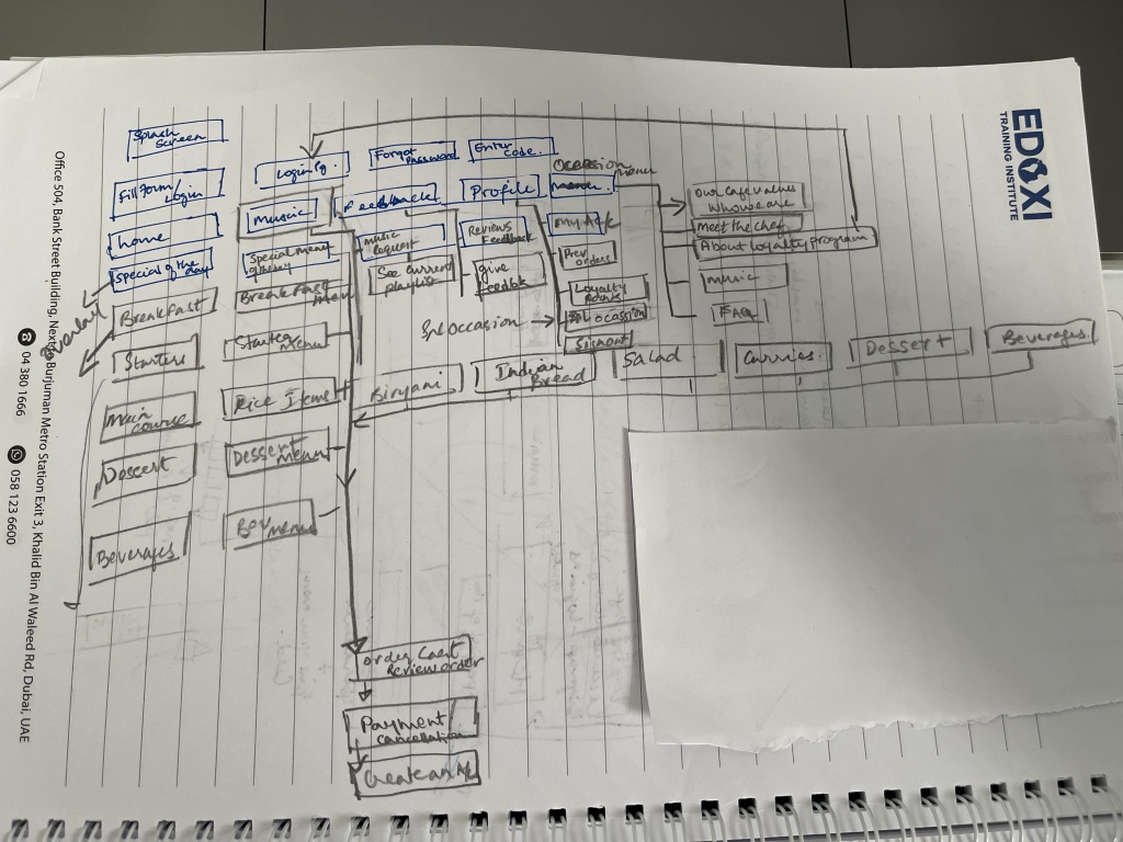
Identifying and fixing the flow of the pages you would include on the website. This helps you identify the number of pages you create and gives the developer an idea of the order.
UI or User Interface is the part of your project that the client or user sees. There are numerous versions of what good UI really is. However, for this project a good UI would be placement of logo and creating the brand elements. A powerful logo makes for good recall. Colors, fonts, and shapes contribute to this recall and are sometimes referred to as brand elements.
Step 4 UI Design
UI Design is the actual page of your website or app design, i.e. how things look and feel. This includes Logo design, colors, branding, and font – every little bit that contributes to making for a very interesting User Interface.
This is the rough color representations or symbolisms in the world today and I have chosen five of these colors as suggestive options and have highlighted the reasons I picked the colors.

C-suite – Pink symbolizes, caring, and calm.
Employee – Blue: Peace, stability, harmony, unity, trust, truth, confidence, conservatism, security, cleanliness, order, loyalty.
Turquoise symbolizes calm. Teal symbolizes sophistication.
HR – Purple: Nobility, spirituality, transformation, wisdom, enlightenment, honour, temperance.
Accounts – Orange: Energy, balance, enthusiasm, vibrant, expansive, flamboyant, demanding of attention.
Admin – Green: Nature, environment, healthy, good luck, renewal, youth, spring, generosity, service.
I have also used combinations of turquoise and teal in lighter shades for the look and feel of the logo and the website. These colors are merely for representation and make a huge difference in perception. (Color symbolism)

The logo design is a star with 5 prongs and the circles are representative of the head of each section that constitutes this company. The circles could have either icons representative of the groups or images/pictures of the heads.
Human Resources is one of the most important functions of a successful company. I have used the Academy Engraved LET font to add weight and gravitas to the logo design.

The landing/splash page has the main message from the company and the links to the respective group/section page. Each section page has its own color scheme representative of what it stands for and symbolizes.
The header tab in each section will have a quote or message from the director or top management.
Employee Tab, in shades of blue and teal and turquoise.

The website is completely developed with actual visualization on what the developer has to create at the backend. Every page has been designed with the ‘ease-of-use’ and functionality of an MNC as a benchmark.
With most companies having an online presence and a hybrid work environment, this website design makes it easy to upload, verify and share personal and professional documentation.

Modernizing the mundane with a splash of energetic colors, the website provides complete access and flexibility in terms of making edits and modifications as required.
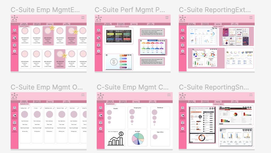
Access to sections and profiles is limited based on admin protocols ensuring employee focus on tasks at hand.
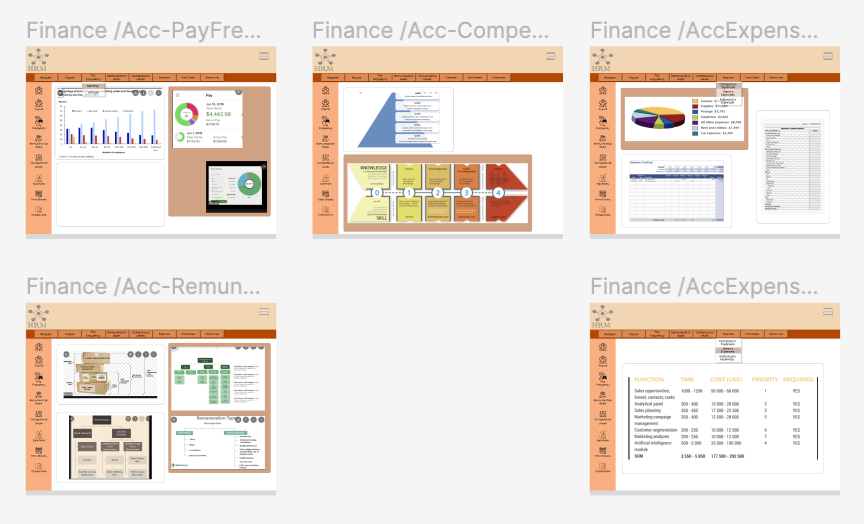
Finance and Admin have access to the entire payroll and employee roster at one place effectively reducing time spent on looking for document and vouchers.
What is included:

Visual Design
Illustration Work
Website UX/UI
Wireframe
Prototyping
Handover to development
Bonus:
Website Content with SEO Compliance.
Project Brief: To create an online menu card for a cafe.
My understanding: Provide a name, logo, mobile friendly menu card.
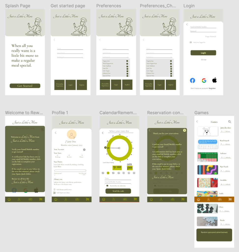
Just a little more is an online café menu. The mobile-friendly menu card is designed with the use of a baker-icon, which is the recommended logo design. The color olive-green has been selected to symbolize the use of organic ingredients in the café.
The café features online reservation options, personalization options, and an option to keep yourself occupied if you have to wait, with the provision of games.
What is included:
Visual Design
App UI/UX
App Wireframe
App Prototype on Figma or Indesign
Final look and feel before hand over to developers
Bonus:
App Content with SEO compliance
what you believe is what you achieve.